
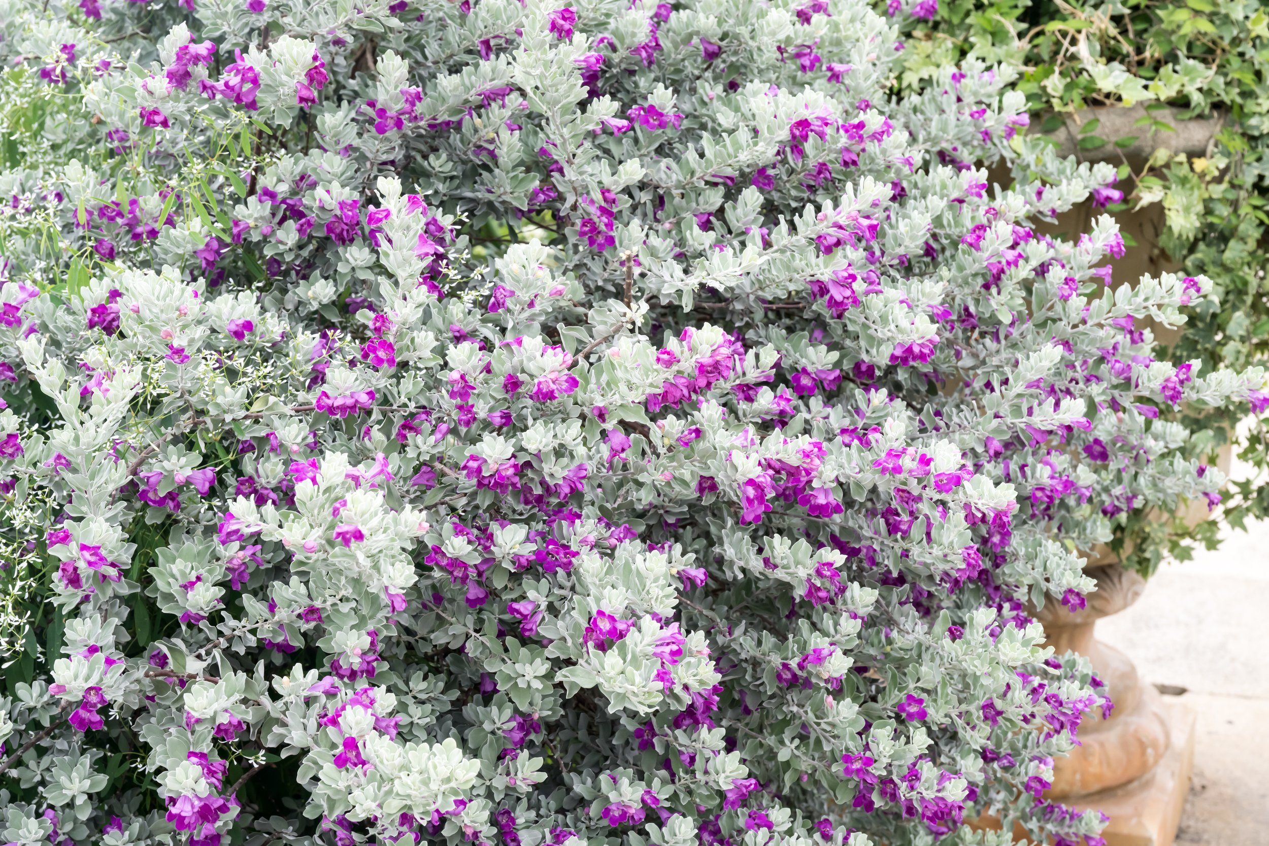
The topic of web accessibiliy makes our small nonprofit think about Silverado Sage (Leucophyllum frutescens). Native to vast stretches of Texas, this icy-blue shrub responds to subtle shifts in the environment, often blooming just before a rain, as if sensing what’s coming before it arrives. When in bloom, its purple flowers fill the air like perfume, evoking the Texas ballad: “Deep in the heart of Texas.”
Like the sage, accessibility work is anticipatory. Yes, we are responsive to needs, but it is more important to cultivating conditions for dignity, equity, and beauty to emerge before they’re demanded. Our website should be navigable to every visitor, whether the site is seen or spoken, modified, or used as-is.
How are we making the website accessible?
MINT Website Accessibility Project 2025
Montessori Institute of North Texas shares its 100% WCAG 2.1 AA-aligned accessibility strategy— including human-audited improvements, hand-coded fixes, and equity-centered design. A living case study in how nonprofits can build truly inclusive websites.
Instead of simply stating our compliance, we are releasing the website accessibility code and the process that helped us. (Option to jump straight to the Appendix)
PLANNING
Step 1. Values
Step 2. Goal
Step 3. Definitions
Step 4. Checklist
PROGRESS
A. Progress Report
A1. Font & Typography
A2. Color
B. Custom Code
B1. Examples
B2. Privacy
B3. Ongoing / Future
APPENDIX
Sharing our code
Track 1. Beginner Version
Header, Footer, Custom CSS
Track 2. Developer Version
Organized by goal
Planning
Step 1. Values
What does MINT believe about accessibility?
Starting with that grounds us for the challenging but attainable work to come.
Our Commitment

The Montessori Institute of North Texas is committed to ensuring our website reflects our values of equity, inclusion, and universal access. As a learning institution, we believe accessibility is both a legal requirement and a moral imperative. It is our responsibility to create digital spaces that serve all users with dignity.
Image description. A sunlit Texas scrubland with silvery-gray sagebrush covering the open meadow. Though the scene appears dry and still, the plants store energy just beneath the surface, preparing to bloom when conditions shift. Their muted-color leaves shimmer in the heat, reflecting the sun away, a symbol of readiness and the privacy: dormant, dignified, and self-contained.
Step 2. Goal
We strive to align with:
WCAG 2.2 Level AA. This is the standard set by the Web Content Accessibility Guidelines, published by W3C in 12 December, 2024— or better.
Section 508 of the U.S. Rehabilitation Act, which also specifies WCAG Level AA.
Human-centered best practices in accessible design, typography, and inclusive navigation
Step 3. Definitions
Three Web Accessibility Standards to Know
-
You can read the rules in detail at this link.
I will make a summary with embedded links. The WCAG 2.2 has 13 guidelines. The guidelines are organized under 4 principles: perceivable, operable, understandable, and robust.For each guideline, there are testable success criteria. The success criteria are at three levels: A, AA, and AAA.
The success criteria are what determine “conformance” to WCAG. That is, in order to meet WCAG, the content needs to meet the success criteria.
-
Section 508 prescribes the standard for all information technology purchased or used by the federal government in the USA.
Even when it does not apply to a company or organization by law, it is still a standard which can be set as the goal.
Section 508 compliance for web content means ensuring that digital content, including websites and applications, is accessible to individuals with disabilities. This is achieved by following the Web Content Accessibility Guidelines (WCAG) 2.0 Level AA, which are the standards used to measure accessibility. WCAG provides specific technical requirements for areas like alt text, keyboard accessibility, color contrast, and screen reader compatibility. -
Where to find the recognized best practices? Two sources.
1. WAI-ARIA Authoring PracticesExamples and guidelines for making widgets and site elements accessible via ARIA attributes.
Practical, well-structured tutorials on making sites accessible. Especially good for testing and screen reader behaviors.
More sources?
On Typography, see the British Dyslexia Association – Style GuideFonts, spacing, and design tips specifically for neurodiverse audiences.
Finally, a source for best practices in Navigation, Microsoft Inclusive Design Toolkit, offering human-first thinking for tech interfaces, including navigation, voice, and situational access
-
Minimum Level
The website provides basic access, but it only allows for some users.
Examples. Alt text entered for photos, site is checked and modified for keyboard navigation, flashing animations are disabled or removed.
-
Standard Level
The website will be accessible for most users
Examples. Color contrast at a ratio minimum of 4.5:1, visible focus, labels for forms. Visible focus means that if you open a site and press tab repeatedly, a highlight will move link to link, button to button, as you tab through. If you do not see this, the site will fail AA, for instance.
-
Enhanced accessibility.
This website provides access for all users, including those with cognitive or sensory impairments.
Examples. High contrast (7:1), extended captions, simplified language, sign language options. This level requires frequent maintenance and vigilance; it will be always a work in progress.
Often, this level is called Exceeding AA-Level, because true AAA may be impossible.
Step 4. Checklist
Q: What are the four guidelines for web accessibility?
A: Perceivable, Operable, Understandable, and Robust.
-
Provide text alternatives for non-text content.
Provide captions and other alternatives for multimedia.
Create content that can be presented in different ways, including by assistive technologies, without losing meaning.
Make it easier for users to see and hear content.
-
Make all functionality available from a keyboard.
Give users enough time to read and use content.
Do not use content that causes seizures.
Help users navigate and find content.
Make it easier to use inputs other than keyboard.
-
Make text readable and understandable.
Make content appear and operate in predictable ways.
Help users avoid and correct mistakes.
-
Maximize compatibility with current and future user tools.
So, how do you get started if that’s the standard?
In our case, we had no extra funding, no additional staff, and had to figure things out ourselves. We’re sharing this progress report to show what’s possible with just a couple of weeks of focused, intermittent effort— chipping away at the work bit by bit. We hope this page will be discovered by someone who needs it. Our hope is that it will save someone time.
Website Accessibility Progress Report
Last Updated May 2025
A. Context
Working with Squarespace: Accessibility Challenges & Workarounds
Our website was built in Squarespace, which is visually elegant but not fully accessible out of the box.
Squarespace limits access to the HTML structure, making it hard to apply semantic markup or modify built-in components.
While we could add custom code via the Advanced > Code Injection fields (Header, Footer, and CSS panels), some scripts failed silently or were stripped by Squarespace’s security filters (likely due to restrictions on inline JS, iframes, or DOM manipulation).
To work around this, we wrote modular, minimal JavaScript and inline SVGs that were injected at runtime and avoided banned tags or attributes.
We used a layered injection strategy: Header for structural overrides, Footer for event listeners and accessibility scripts, and CSS panel for styling fixes.
Success often required trial-and-error, inspecting live DOM output, and mimicking native Squarespace class structures to avoid breakage.
This process was time-intensive, but it allowed us to force WCAG-aligned behaviors like skip links, focus states, motion reduction, and ARIA labeling, despite platform limitations.
A1. Font and Typography Improvements
Typography plays a central role in digital accessibility. In April 2025, we transitioned all site fonts to Helvetica and Segoe UI, selected for their demonstrated legibility, strong performance across devices, and alignment with accessibility principles—especially for users with cognitive or visual processing differences. For platforms that had neither a Helvetica light or Segoe UI light (like Squarespace!) we selected Lato for its similarity in body text.
Why Helvetica, Segoe UI, Lato?
- Sans-serif structure reduces visual clutter
- Consistent spacing and forms reduce confusion
- Familiarity reduces cognitive load (A new idea to us!)
- Web-safe fallback for universal access
- Screen-optimized design with high legibility
- Sharpness at small sizes supports mobile use
- Neutral tone aligns with Montessori aesthetics
A2. Color and Visual Clarity Enhancements
- Full color contrast audit with WCAG 2.2 standards
- Retired low-contrast and hover-to-reveal styles
- Implemented system-level motion reduction
- Eliminated all text-over-image headers
Old Color Scheme: Our Wake-up Call


Earth-tones with orchre olive predominating, to communicate nature-based mission of the nonprofit
PRIOR
Test 1 on WEBAIM Contrast Checker:
Primary web font color on our primary background.
Passing contrast ratio:
4 : 1
Our score here:
🔴 2.4 : 1
Comparison of legibility at smaller size


Cormorant Garamond
Lato


Before & After


Helvetica: A recommended font for Dyslexia, often available in various platforms (or a similar font). Helvetica has been a stand-by choice for visual clarity for at least 50 years.
Is it exciting? No. But, we add personality with a brown-gray color and “light” weight, to add airiness and natural connection.
New Color Scheme


Contrast-centered
palette;
also built off our
international NGO
color branding standards
Re-test on WEBAIM
Contrast Checker:
Primary body font color on our primary background.
Passing contrast ratio:
4 : 1
New score:
🟢 7.5 : 1
( AAA)
Re-test on WEBAIM
Contrast Checker:
Accent Header color on our primary background.
Passing contrast ratio:
4 : 1
New score:
🟢 4.5 : 1
NOTE:
AA at body text size, but this is header!
(AAA)

PRIOR
Test 2 on WEBAIM Contrast Checker:
Primary web font on our secondary background.
Passing contrast ratio:
4:1
Our score here:
🔴 1.7 : 1
We were blown away by this gain—

Re-test on WEBAIM
Contrast Checker:
Primary Header color, link color, on our primary background.
Passing contrast ratio:
4 : 1
New score:
🟢 8.9 : 1
(AAA)
B. Custom Code and Functional Overrides
To overcome Squarespace limitations, we developed over 13 pages of custom code, written by hand in HTML, CSS, and JavaScript, to inject accessible behaviors and enforce WCAG 2.2 compliance. We knew VERY little about this beforehand and just took it one step at a time.
1. Examples of Enhancements
- Accessible header search button with ARIA + SVG — This took hours of trial and error to overpower Squarespace scripts, to allow us to put it in the site Header.
- Skip link and modal focus trap
- Global link styling with bold + underline + hue shift
- Contrast-safe backgrounds and visual focus indicators
- `@media` queries to stop animation if user prefers reduced motion
- Form label + button role fixes
- Typography scaling with CSS clamp() and em units
- “To Top” button as simple enhancement
2. Privacy as Access
- No monetized cookies or tracking scripts are in use. Our new Cookie Agreement pop-up states that we do not allow this type of data mining on our site.
- No data is passively collected or sold. The only cookies allowed are for CAPTCHA in the email subscription box and a cookie which blocks bot attacks fraudulently impersonating our site, for the security of people browsing here.
- Third-party privacy audit completed and publicly available on new Privacy page. We used SEOMATOR for the audit, which is free.
3. What We’re Still Working On
- Aligning all pages to consistent H1–H2–H3 structure for machine readability
- Preparing to build a full sitemap once individual page utility has been optimized
Goals to add Breadcrumb map on each page. It would be nice if this could be accomplished with a site level script. We don’t know how to do this yet, but we are going to study and try it over the next month.
- Retrofitting embedded legacy content for accessibility
Internal documentation and staff training on inclusive content; have shared general principles weekly and are establishing colleague templates for ease of adoption
Asset examples we used in the transition
There were a few days that things did not look right on the site. We got these notices together, drawing Illustrator SVGs and using Canva. We did not want to alarm site guests when things did not work or looked strange.


Appendix: Sharing Our Code Injection
Choose your own adventure! What is the level of complexity you want to see? Pick “Easy” or “Technical” on the level of complexity you want to see.
LEFT SIDE
🪴 Track 1: Beginner Friendly
How We Made a Squarespace Site Accessible — Without Being Pro-Coders
Description:
Squarespace doesn’t come fully accessible, and we couldn’t edit the core code. But we figured out how to “inject” little pieces of custom code into the site’s Header, Footer, and Custom CSS “Advanced” panel to fix important accessibility issues. In this section, we share exactly what we did (with copy-paste examples), how we got around what didn’t work, and how even small changes made a big difference for users relying on keyboard navigation, screen readers, and low-vision tools. If you’re working in Squarespace and care about inclusion, this will help you skip weeks of trial-and-error.
🧭 1. Beginner: How to Access the Header Code Panel in Squarespace
Log into your Squarespace site.
In the left-hand menu, click ⚙️ Settings.
Scroll down to Advanced > click Code Injection.
In the Header box (top of the page), paste the code below.
Save changes, then refresh your site to test.
⚠️ This code is safe to paste, but always test changes on a duplicate page first if your site is live.
-
<!-- ================================
MINT Accessibility Header Toolkit
WCAG 2.1 AA Enhancements – v1.0
================================ -->
<!-- ✅ Pinterest Site Verification (remove if not using Pinterest) -->
<meta name="p:domain_verify" content="99e6ed1790d57bc2f0365f4169084177"/>
<!-- ✅ Skip Link for Keyboard Users -->
<a href="#main-content" class="skip-to-content-link">Skip to Main Content</a>
<!-- ✅ jQuery Library (safe fallback if not already loaded) -->
<script src="https://ajax.googleapis.com/ajax/libs/jquery/3.6.0/jquery.min.js"></script>
<!-- ✅ Custom Search Toggle Button for Header -->
<script>
document.addEventListener("DOMContentLoaded", function () {
const header = document.querySelector(".header-actions");
if (!header || document.querySelector("#mint-search-toggle")) return;
// Create a circular button
const button = document.createElement("button");
button.id = "mint-search-toggle";
button.setAttribute("aria-label", "Toggle Search");
button.style.cssText = `
background: transparent;
border: 2px solid #36b4a9;
border-radius: 50%;
width: 48px;
height: 48px;
margin-left: 1rem;
cursor: pointer;
display: inline-flex;
align-items: center;
justify-content: center;
transition: background-color 0.3s ease;
`;
// Insert magnifier icon using inline SVG
const svg = document.createElementNS("http://www.w3.org/2000/svg", "svg");
svg.setAttribute("viewBox", "0 0 24 24");
svg.setAttribute("width", "28");
svg.setAttribute("height", "28");
svg.style.fill = "#36b4a9";
svg.innerHTML = `<path d="M15.5 14h-.79l-.28-.27a6.5 6.5 0 1 0-.71.71l.27.28v.79l5 5 1.5-1.5-5-5zm-6.5 0a5 5 0 1 1 0-10 5 5 0 0 1 0 10z"/>`;
button.appendChild(svg);
// Toggle display of search bar
button.addEventListener("click", () => {
const searchBar = document.getElementById("header-search");
if (searchBar) {
const isVisible = getComputedStyle(searchBar).display !== "none";
searchBar.style.display = isVisible ? "none" : "block";
}
});
// Hover styling for button
button.addEventListener("mouseenter", () => {
button.style.backgroundColor = "#36b4a9";
svg.style.fill = "#ffffff";
});
button.addEventListener("mouseleave", () => {
button.style.backgroundColor = "transparent";
svg.style.fill = "#36b4a9";
});
header.appendChild(button);
});
</script>
<!-- ✅ CSS Fallback for Search Button (in case site resets styles) -->
<style>
#mint-search-toggle {
width: 48px !important;
height: 48px !important;
border: 2px solid #36b4a9 !important;
border-radius: 50% !important;
background: transparent !important;
display: inline-flex !important;
align-items: center !important;
justify-content: center !important;
padding: 0 !important;
margin-left: 1rem !important;
}
#mint-search-toggle svg,
#mint-search-toggle svg path {
width: 28px !important;
height: 28px !important;
fill: #36b4a9 !important;
display: block !important;
opacity: 1 !important;
stroke: none !important;
transition: fill 0.3s ease !important;
}
#mint-search-toggle:hover svg,
#mint-search-toggle:hover svg path {
fill: white !important;
}
</style>
<!-- ✅ (Optional) Spark Plugin for “Back to Top” Button – Remove if not using -->
<script id="spark-placeholder"></script>
<script id="spark-app" src="https://app.sparkplugin.com/app.js" data-token="6bc3ae6cc0d06b2e2bdb76dc8ecb16e5" async></script>
<!-- ✅ Style Fix for Spark Buttons -->
<style>
a[href="#top"],
.spark-button a[href="#top"] {
color: #ffffff !important;
font-weight: 700 !important;
text-decoration: underline !important;
text-decoration-thickness: 1.5px !important;
text-underline-offset: 2px !important;
transition: color 0.2s ease !important;
}
a[href="#top"]:hover,
.spark-button a[href="#top"]:hover {
color: #c2d3be !important;
}
</style>
🧭 2. Beginner: How to Access the Footer Code Panel in Squarespace
Log into your Squarespace account and open your website.
In the left-hand menu, click ⚙️ Settings.
Scroll down and select Advanced.
Click on Code Injection.
Scroll to the large Footer box (beneath the Header box).
Paste the code from the next section there.
Click Save at the top left.
Visit your live site and refresh the page to test.
✅ The footer is the best place to load scripts that modify how the page behaves after it finishes loading—perfect for accessibility features like skip links, screen reader alerts, and toggling search menus.
This footer code works hand-in-hand with your header and CSS. Together, they:
Add a floating, screen-reader-friendly search bar
Enable skip-link navigation with proper heading anchors
Provide auditory announcements for screen reader users
Respect layout quirks like sticky headers
-
<!-- ================================
MINT Accessibility Footer Toolkit
WCAG 2.1 AA Enhancements – v1.0
================================ -->
<!-- 🔍 Floating Search Bar HTML (Hidden by default, toggled by button in header) -->
<div id="header-search" style="display:none; position:absolute; top:100px; right:2rem; z-index:9999; width:400px; background:#f8fbf8; border:1px solid #36b4a9; border-radius:10px; padding:12px 16px; box-shadow:0 6px 12px rgba(0,0,0,0.15); font-family:inherit;">
<form action="/search" method="GET" style="display:flex; align-items:center;">
<input type="text" name="q" placeholder="Type to search…" style="flex:1; border:none; outline:none; font-size:16px; padding:6px 10px; background:transparent; color:#333;" />
<button type="submit" aria-label="Submit Search" style="background:none; border:none; cursor:pointer; font-size:18px; color:#666; margin-left:10px;">🔍</button>
<button type="button" class="close-search" aria-label="Close Search" style="background:none; border:none; cursor:pointer; font-size:18px; color:#666; margin-left:10px;">×</button>
</form>
</div>
<!-- 🔍 Close Button Functionality for Search Bar -->
<script>
document.addEventListener("DOMContentLoaded", function () {
const closeBtn = document.querySelector(".close-search");
if (closeBtn) {
closeBtn.addEventListener("click", function () {
const bar = document.getElementById("header-search");
if (bar) bar.style.display = "none";
});
}
});
</script>
<!-- ✅ Skip Link Anchor Target for Keyboard Users -->
<script>
document.addEventListener("DOMContentLoaded", function () {
const main = document.querySelector("main#page");
if (main && !document.getElementById("main-content")) {
const anchor = document.createElement("div");
anchor.id = "main-content";
anchor.tabIndex = -1; // allows keyboard focus
main.parentNode.insertBefore(anchor, main);
}
});
</script>
<!-- 🗣️ ARIA Live Region for Screen Reader Announcements -->
<div id="aria-live-feedback" aria-live="polite" aria-atomic="true" style="position:absolute;width:1px;height:1px;overflow:hidden;clip:rect(1px,1px,1px,1px);"></div>
<script>
function announceToScreenReader(message) {
const region = document.getElementById("aria-live-feedback");
if (region) {
region.textContent = "";
setTimeout(() => {
region.textContent = message;
}, 100); // Small delay ensures message is spoken
}
}
</script>
<!-- 🔔 Announce Search Bar Opening/Closing -->
<script>
document.addEventListener("DOMContentLoaded", function () {
const searchBtn = document.querySelector("#mint-search-toggle");
const searchBox = document.getElementById("header-search");
if (searchBtn && searchBox) {
searchBtn.addEventListener("click", () => {
const visible = getComputedStyle(searchBox).display !== "none";
announceToScreenReader(visible ? "Search bar expanded. Type to search." : "Search bar closed.");
});
}
});
</script>
<!-- ✅ Ensure Skip Link Scrolls to Correct Spot Below Sticky Header -->
<style>
#main-content {
scroll-margin-top: 5rem;
}
</style>
🧭 3. Beginner: How to Add Custom Accessibility CSS in Squarespace
Log into your Squarespace account.
In the left-hand menu, click Design.
Choose Custom CSS.
Paste the code below into the big editor box.
Scroll down and click Save.
✅ You should see changes instantly. If not, refresh the live site. You can undo or remove anything at any time.
-
/* ============================================================
MINT Accessibility CSS Toolkit – v1.0
WCAG 2.1 AA Compliance via Custom CSS
============================================================ */
/* ✨ Skip Link Styling – Hidden until focused */
.skip-to-content-link {
position: absolute;
top: -40px;
left: 0;
background-color: #85C996;
color: white;
padding: 0.5em 1em;
z-index: 9999;
text-decoration: none;
font-weight: 600;
border-radius: 0 0 8px 0;
box-shadow: 0 2px 6px rgba(0,0,0,0.15);
transition: top 0.3s ease, opacity 0.3s ease;
opacity: 0;
}
.skip-to-content-link:focus {
top: 0;
opacity: 1;
}
/* ✅ Reduced Motion for Neurodiverse Users */
@media (prefers-reduced-motion: reduce) {
, ::before, *::after {
animation: none !important;
transition: none !important;
scroll-behavior: auto !important;
}
}
/* ✅ Focus Indicators – Always Visible When Navigating by Keyboard */
*:focus-visible {
outline: 2px solid #36b4a9;
outline-offset: 3px;
border-radius: 4px;
}
a:focus-visible,
button:focus-visible,
input:focus-visible {
box-shadow: 0 0 0 3px rgba(54, 180, 169, 0.4);
}
*:focus:not(:focus-visible) {
outline: none !important;
}
/* ✅ Accessible Link Styling – Not Just Color */
a {
color: #0D498D;
text-decoration: underline;
text-decoration-thickness: 1px;
text-underline-offset: 2px;
font-weight: 600;
transition: color 0.2s ease;
}
a:hover,
a:focus {
color: #36B4A9;
text-decoration-thickness: 2px;
}
/* ✅ Universal Link Styling (All Contexts) */
a:not(.sqs-block-button-element):not(.header-nav-item):not([class*="button"]) {
color: #0D498D !important;
font-weight: 700 !important;
text-decoration: underline !important;
text-decoration-thickness: 1.5px !important;
text-underline-offset: 2px !important;
}
.sqs-block-content a,
.card-content a,
p a,
li a,
span a {
color: #0D498D !important;
font-weight: 600 !important;
text-decoration: underline !important;
text-decoration-thickness: 1.5px;
text-underline-offset: 2px;
}
/* ✅ Button and Form Field Enhancements */
button,
a.sqs-block-button-element {
cursor: pointer;
min-height: 44px;
padding: 0.6em 1.2em;
background-color: #36b4a9 !important;
color: white !important;
border: none;
border-radius: 4px;
font-weight: 600;
transition: background-color 0.2s ease;
}
button:hover,
a.sqs-block-button-element:hover {
background-color: #0d498d !important;
}
input:focus,
textarea:focus,
select:focus {
border-color: #36b4a9 !important;
box-shadow: 0 0 0 2px rgba(54, 180, 169, 0.25);
}
/* ✅ Detect Images Without Alt Attributes */
img:not([alt]) {
outline: 2px dashed red !important;
}
/* ✅ Typography Adjustments – Scalable, Readable Fonts */
body {
font-size: clamp(1rem, 1.2vw, 1.125rem);
line-height: 1.6;
word-wrap: break-word;
}
h1, h2, h3 {
line-height: 1.25;
margin-top: 1.2em;
margin-bottom: 0.5em;
}
/* ✅ Mobile Typography Scale */
@media (max-width: 600px) {
html {
font-size: 110%;
}
}
/* ✅ Skip Link Anchor Positioning (under sticky headers) */
#main-content {
scroll-margin-top: 5rem;
}
/* ✅ Header Button Override – Hides Squarespace Default Search */
.header-actions .sqs-search-button {
display: none !important;
}
RIGHT SIDE
🔧 Track 2: Developer Oriented
Injecting WCAG-Compliant Accessibility Fixes into Squarespace via Header, Footer, and CSS
Description:
This section outlines how we manually implemented WCAG 2.1 AA accessibility features within the constraints of Squarespace’s code injection system. We provide real working examples of header and footer JavaScript, inline SVG injections, ARIA enhancements, and custom CSS to correct platform limitations, such as missing skip links, insufficient contrast, inaccessible navigation elements, and keyboard focus handling. Ideal for front-end developers working within a closed CMS.
-
<!DOCTYPE html>
<html lang="en">
<head>
<meta charset="UTF-8">
<meta name="viewport" content="width=device-width, initial-scale=1.0">
<title>Squarespace Accessibility Toolkit – MINT Edition</title>
<style>
body {
font-family: Segoe UI, Helvetica Neue, sans-serif;
color: #555549;
font-size: 11pt;
background: #f9f9f6;
padding: 2rem;
}
h1, h2 {
color: #0D498D;
}
summary {
font-weight: bold;
font-size: 1.05rem;
cursor: pointer;
padding: 0.5em;
background-color: #e4efea;
border: 1px solid #c2d3be;
border-radius: 6px;
margin-top: 1rem;
}
details {
margin-bottom: 1.5rem;
background: #ffffff;
border: 1px solid #ddd;
border-radius: 6px;
padding: 1rem;
box-shadow: 0 2px 5px rgba(0,0,0,0.05);
}
code {
background: #f3f7f4;
display: block;
white-space: pre-wrap;
padding: 0.75rem;
border-radius: 4px;
border: 1px solid #d5e5dd;
margin-top: 0.5rem;
font-size: 0.95rem;
}
</style>
</head>
<body>
<h1>Squarespace Accessibility Toolkit <br><span style="font-weight:normal; font-size:0.8em;">Montessori Institute of North Texas</span></h1>
<p>This toolkit is a modular collection of code we developed to overcome accessibility limitations within the Squarespace platform. Organized by topic, each expandable section below includes a short explanation and a copy-paste code snippet.</p>
<details>
<summary>🔗 Skip Link for Keyboard Navigation</summary>
<p>Adds a visible skip link for screen reader and keyboard-only users, allowing quick jumps to main content.</p>
<code>
<a href="#main-content" class="skip-to-content-link">Skip to Main Content</a>
/* CSS */
.skip-to-content-link {
position: absolute;
top: -40px;
left: 0;
background-color: #85C996;
color: white;
padding: 0.5em 1em;
z-index: 9999;
text-decoration: none;
font-weight: 600;
border-radius: 0 0 8px 0;
box-shadow: 0 2px 6px rgba(0,0,0,0.15);
transition: top 0.3s ease, opacity 0.3s ease;
opacity: 0;
}
.skip-to-content-link:focus {
top: 0;
opacity: 1;
}
</code>
</details>
<details>
<summary>🧭 Focus Styling for Keyboard Users</summary>
<p>Ensures that keyboard navigation provides clear outlines and visual feedback (required for WCAG 2.1 AA).</p>
<code>
*:focus-visible {
outline: 2px solid #36b4a9;
outline-offset: 3px;
border-radius: 4px;
transition: outline 0.2s ease;
}
*:focus:not(:focus-visible) {
outline: none !important;
box-shadow: none !important;
}
</code>
</details>
<details>
<summary>🔍 Custom Search Toggle Button + Bar</summary>
<p>Injects a clean toggle button in the header that expands/collapses a floating search bar, with full keyboard and screen reader support.</p>
<code>
/* JavaScript (Header Injection) */
document.addEventListener("DOMContentLoaded", function () {
const header = document.querySelector(".header-actions");
if (!header || document.querySelector("#mint-search-toggle")) return;
const button = document.createElement("button");
button.id = "mint-search-toggle";
button.setAttribute("aria-label", "Toggle Search");
button.style.cssText = "..."; // full styles in original code
const svg = document.createElementNS("http://www.w3.org/2000/svg", "svg");
svg.setAttribute("viewBox", "0 0 24 24");
svg.innerHTML = `<path d="..." />`;
button.appendChild(svg);
button.addEventListener("click", ...);
header.appendChild(button);
});
/* Corresponding CSS */
#mint-search-toggle { /* styles here */ }
#mint-search-toggle:hover svg { fill: white !important; }
</code>
</details>
<details>
<summary>🗣️ Screen Reader Announcements (ARIA Live)</summary>
<p>Adds a hidden live region to announce changes to screen readers (like toggling the search bar).</p>
<code>
<div id="aria-live-feedback" aria-live="polite" aria-atomic="true" style="..."></div>
function announceToScreenReader(message) {
const region = document.getElementById("aria-live-feedback");
if (region) {
region.textContent = "";
setTimeout(() => { region.textContent = message; }, 100);
}
}
</code>
</details>
</body>
</html>
-
<!DOCTYPE html>
<html lang="en">
<head>
<meta charset="UTF-8">
<meta name="viewport" content="width=device-width, initial-scale=1.0">
<title>Squarespace Accessibility Toolkit – MINT Edition</title>
<style>
body {
font-family: Segoe UI, Helvetica Neue, sans-serif;
color: #555549;
font-size: 11pt;
background: #f9f9f6;
padding: 2rem;
}
h1, h2 {
color: #0D498D;
}
summary {
font-weight: bold;
font-size: 1.05rem;
cursor: pointer;
padding: 0.5em;
background-color: #e4efea;
border: 1px solid #c2d3be;
border-radius: 6px;
margin-top: 1rem;
}
details {
margin-bottom: 1.5rem;
background: #ffffff;
border: 1px solid #ddd;
border-radius: 6px;
padding: 1rem;
box-shadow: 0 2px 5px rgba(0,0,0,0.05);
}
code {
background: #f3f7f4;
display: block;
white-space: pre-wrap;
padding: 0.75rem;
border-radius: 4px;
border: 1px solid #d5e5dd;
margin-top: 0.5rem;
font-size: 0.95rem;
}
</style>
</head>
<body>
<h1>Squarespace Accessibility Toolkit <br><span style="font-weight:normal; font-size:0.8em;">Montessori Institute of North Texas</span></h1>
<p>This toolkit is a modular collection of code we developed to overcome accessibility limitations within the Squarespace platform. Organized by topic, each expandable section below includes a short explanation and a copy-paste code snippet.</p>
<details>
<summary>🔗 Skip Link for Keyboard Navigation</summary>
<p>Adds a visible skip link for screen reader and keyboard-only users, allowing quick jumps to main content.</p>
<code>
<a href="#main-content" class="skip-to-content-link">Skip to Main Content</a>
/* CSS */
.skip-to-content-link {
position: absolute;
top: -40px;
left: 0;
background-color: #85C996;
color: white;
padding: 0.5em 1em;
z-index: 9999;
text-decoration: none;
font-weight: 600;
border-radius: 0 0 8px 0;
box-shadow: 0 2px 6px rgba(0,0,0,0.15);
transition: top 0.3s ease, opacity 0.3s ease;
opacity: 0;
}
.skip-to-content-link:focus {
top: 0;
opacity: 1;
}
</code>
</details>
<details>
<summary>🧭 Focus Styling for Keyboard Users</summary>
<p>Ensures that keyboard navigation provides clear outlines and visual feedback (required for WCAG 2.1 AA).</p>
<code>
*:focus-visible {
outline: 2px solid #36b4a9;
outline-offset: 3px;
border-radius: 4px;
transition: outline 0.2s ease;
}
*:focus:not(:focus-visible) {
outline: none !important;
box-shadow: none !important;
}
</code>
</details>
<details>
<summary>🔍 Custom Search Toggle Button + Bar</summary>
<p>Injects a clean toggle button in the header that expands/collapses a floating search bar, with full keyboard and screen reader support.</p>
<code>
/* JavaScript (Header Injection) */
document.addEventListener("DOMContentLoaded", function () {
const header = document.querySelector(".header-actions");
if (!header || document.querySelector("#mint-search-toggle")) return;
const button = document.createElement("button");
button.id = "mint-search-toggle";
button.setAttribute("aria-label", "Toggle Search");
button.style.cssText = "..."; // full styles in original code
const svg = document.createElementNS("http://www.w3.org/2000/svg", "svg");
svg.setAttribute("viewBox", "0 0 24 24");
svg.innerHTML = `<path d="..." />`;
button.appendChild(svg);
button.addEventListener("click", ...);
header.appendChild(button);
});
/* Corresponding CSS */
#mint-search-toggle { /* styles here */ }
#mint-search-toggle:hover svg { fill: white !important; }
</code>
</details>
<details>
<summary>🗣️ Screen Reader Announcements (ARIA Live)</summary>
<p>Adds a hidden live region to announce changes to screen readers (like toggling the search bar).</p>
<code>
<div id="aria-live-feedback" aria-live="polite" aria-atomic="true" style="..."></div>
function announceToScreenReader(message) {
const region = document.getElementById("aria-live-feedback");
if (region) {
region.textContent = "";
setTimeout(() => { region.textContent = message; }, 100);
}
}
</code>
</details>
<details>
<summary>📝 Readable Typography + Mobile Scaling</summary>
<p>Adjusts default font size and spacing for legibility and ensures it scales well on smaller screens.</p>
<code>
/* Responsive Base Font Size */
body {
font-size: clamp(1rem, 1.2vw, 1.125rem);
line-height: 1.6;
word-wrap: break-word;
overflow-wrap: break-word;
}
/* Heading Spacing */
h1, h2, h3 {
line-height: 1.25;
margin-top: 1.2em;
margin-bottom: 0.5em;
}
/* Scale Up Slightly on Small Screens */
@media (max-width: 600px) {
html {
font-size: 110%;
}
}
</code>
</details>
<details>
<summary>🔘 Buttons + Form Field Enhancements</summary>
<p>Improves accessibility of buttons and form inputs by increasing tap targets, hover contrast, and keyboard focus visibility.</p>
<code>
button,
a.sqs-block-button-element {
cursor: pointer;
min-height: 44px;
padding: 0.6em 1.2em;
background-color: #36b4a9 !important;
color: #ffffff !important;
border: none;
border-radius: 4px;
font-weight: 600;
transition: background-color 0.2s ease;
}
button:hover,
a.sqs-block-button-element:hover {
background-color: #0d498d !important;
color: #ffffff !important;
}
input:focus,
textarea:focus,
select:focus {
border-color: #36b4a9 !important;
box-shadow: 0 0 0 2px rgba(54, 180, 169, 0.25);
}
</code>
</details>
</body>
</html>
-
Item description<!DOCTYPE html>
<html lang="en">
<head>
<meta charset="UTF-8">
<meta name="viewport" content="width=device-width, initial-scale=1.0">
<title>Squarespace Accessibility Toolkit – MINT Edition</title>
<style>
body {
font-family: Segoe UI, Helvetica Neue, sans-serif;
color: #555549;
font-size: 11pt;
background: #f9f9f6;
padding: 2rem;
}
h1, h2 {
color: #0D498D;
}
summary {
font-weight: bold;
font-size: 1.05rem;
cursor: pointer;
padding: 0.5em;
background-color: #e4efea;
border: 1px solid #c2d3be;
border-radius: 6px;
margin-top: 1rem;
}
details {
margin-bottom: 1.5rem;
background: #ffffff;
border: 1px solid #ddd;
border-radius: 6px;
padding: 1rem;
box-shadow: 0 2px 5px rgba(0,0,0,0.05);
}
code {
background: #f3f7f4;
display: block;
white-space: pre-wrap;
padding: 0.75rem;
border-radius: 4px;
border: 1px solid #d5e5dd;
margin-top: 0.5rem;
font-size: 0.95rem;
}
</style>
</head>
<body>
<h1>Squarespace Accessibility Toolkit <br><span style="font-weight:normal; font-size:0.8em;">Montessori Institute of North Texas</span></h1>
<p>This toolkit is a modular collection of code we developed to overcome accessibility limitations within the Squarespace platform. Organized by topic, each expandable section below includes a short explanation and a copy-paste code snippet.</p>
<!-- Existing accordions omitted for brevity -->
<details>
<summary>🌀 Reduced Motion for Accessibility Preferences</summary>
<p>Disables animations, transitions, and motion effects when the user's operating system requests reduced motion. This helps people with vestibular disorders or sensory sensitivity.</p>
<code>
@media (prefers-reduced-motion: reduce) {
, ::before, *::after {
animation: none !important;
transition: none !important;
scroll-behavior: auto !important;
}
.spark-effect-fade,
.spark-fadein,
.spark-floatin,
.spark-hover-glow,
.spark-pulse {
animation: none !important;
transform: none !important;
opacity: 1 !important;
}
}
</code>
</details>
</body>
</html>
-
<!DOCTYPE html>
<html lang="en">
<head>
<meta charset="UTF-8">
<meta name="viewport" content="width=device-width, initial-scale=1.0">
<title>Squarespace Accessibility Toolkit – MINT Edition</title>
<style>
body {
font-family: Segoe UI, Helvetica Neue, sans-serif;
color: #555549;
font-size: 11pt;
background: #f9f9f6;
padding: 2rem;
}
h1, h2 {
color: #0D498D;
}
summary {
font-weight: bold;
font-size: 1.05rem;
cursor: pointer;
padding: 0.5em;
background-color: #e4efea;
border: 1px solid #c2d3be;
border-radius: 6px;
margin-top: 1rem;
}
details {
margin-bottom: 1.5rem;
background: #ffffff;
border: 1px solid #ddd;
border-radius: 6px;
padding: 1rem;
box-shadow: 0 2px 5px rgba(0,0,0,0.05);
}
code {
background: #f3f7f4;
display: block;
white-space: pre-wrap;
padding: 0.75rem;
border-radius: 4px;
border: 1px solid #d5e5dd;
margin-top: 0.5rem;
font-size: 0.95rem;
}
</style>
</head>
<body>
<h1>Squarespace Accessibility Toolkit <br><span style="font-weight:normal; font-size:0.8em;">Montessori Institute of North Texas</span></h1>
<p>This toolkit is a modular collection of code we developed to overcome accessibility limitations within the Squarespace platform. Organized by topic, each expandable section below includes a short explanation and a copy-paste code snippet.</p>
<!-- Existing accordions omitted for brevity -->
<details>
<summary>🌀 Reduced Motion for Accessibility Preferences</summary>
<p>Disables animations, transitions, and motion effects when the user's operating system requests reduced motion. This helps people with vestibular disorders or sensory sensitivity.</p>
<code>
@media (prefers-reduced-motion: reduce) {
, ::before, *::after {
animation: none !important;
transition: none !important;
scroll-behavior: auto !important;
}
.spark-effect-fade,
.spark-fadein,
.spark-floatin,
.spark-hover-glow,
.spark-pulse {
animation: none !important;
transform: none !important;
opacity: 1 !important;
}
}
</code>
</details>
<details>
<summary>🔗 Universal Link Styling for Clarity</summary>
<p>Ensures all links are clearly recognizable with underline and bold styles, not relying on color alone. Meets WCAG 2.1 AA requirements for non-color visual indicators.</p>
<code>
a:not(.sqs-block-button-element):not(.header-nav-item):not([class*="button"]),
.sqs-block-content a,
.list-item-content a,
.card-content a,
p a,
li a,
span a {
color: #0D498D !important;
font-weight: 700 !important;
text-decoration: underline !important;
text-decoration-thickness: 1.5px !important;
text-underline-offset: 2px !important;
transition: color 0.2s ease;
}
a:hover,
a:focus,
.sqs-block-content a:hover,
.list-item-content a:hover,
.card-content a:hover {
color: #36B4A9 !important;
text-decoration-thickness: 2px;
}
</code>
</details>
</body>
</html>
-
<!DOCTYPE html>
<html lang="en">
<head>
<meta charset="UTF-8">
<meta name="viewport" content="width=device-width, initial-scale=1.0">
<title>Squarespace Accessibility Toolkit – MINT Edition</title>
<style>
body {
font-family: Segoe UI, Helvetica Neue, sans-serif;
color: #555549;
font-size: 11pt;
background: #f9f9f6;
padding: 2rem;
}
h1, h2 {
color: #0D498D;
}
summary {
font-weight: bold;
font-size: 1.05rem;
cursor: pointer;
padding: 0.5em;
background-color: #e4efea;
border: 1px solid #c2d3be;
border-radius: 6px;
margin-top: 1rem;
}
details {
margin-bottom: 1.5rem;
background: #ffffff;
border: 1px solid #ddd;
border-radius: 6px;
padding: 1rem;
box-shadow: 0 2px 5px rgba(0,0,0,0.05);
}
code {
background: #f3f7f4;
display: block;
white-space: pre-wrap;
padding: 0.75rem;
border-radius: 4px;
border: 1px solid #d5e5dd;
margin-top: 0.5rem;
font-size: 0.95rem;
}
</style>
</head>
<body>
<h1>Squarespace Accessibility Toolkit <br><span style="font-weight:normal; font-size:0.8em;">Montessori Institute of North Texas</span></h1>
<p>This toolkit is a modular collection of code we developed to overcome accessibility limitations within the Squarespace platform. Organized by topic, each expandable section below includes a short explanation and a copy-paste code snippet.</p>
<!-- Existing accordions omitted for brevity -->
<details>
<summary>🖼️ Image Audit Highlighting for Missing Alt Text</summary>
<p>This diagnostic rule outlines any image missing an <code>alt</code> attribute with a red dashed border, so you can catch issues quickly during development.</p>
<code>
img:not([alt]) {
outline: 2px dashed red !important;
}
</code>
</details>
</body>
</html>
-
Item description<!DOCTYPE html>
<html lang="en">
<head>
<meta charset="UTF-8">
<meta name="viewport" content="width=device-width, initial-scale=1.0">
<title>Squarespace Accessibility Toolkit – MINT Edition</title>
<style>
body {
font-family: Segoe UI, Helvetica Neue, sans-serif;
color: #555549;
font-size: 11pt;
background: #f9f9f6;
padding: 2rem;
}
h1, h2 {
color: #0D498D;
}
summary {
font-weight: bold;
font-size: 1.05rem;
cursor: pointer;
padding: 0.5em;
background-color: #e4efea;
border: 1px solid #c2d3be;
border-radius: 6px;
margin-top: 1rem;
}
details {
margin-bottom: 1.5rem;
background: #ffffff;
border: 1px solid #ddd;
border-radius: 6px;
padding: 1rem;
box-shadow: 0 2px 5px rgba(0,0,0,0.05);
}
code {
background: #f3f7f4;
display: block;
white-space: pre-wrap;
padding: 0.75rem;
border-radius: 4px;
border: 1px solid #d5e5dd;
margin-top: 0.5rem;
font-size: 0.95rem;
}
</style>
</head>
<body>
<h1>Squarespace Accessibility Toolkit <br><span style="font-weight:normal; font-size:0.8em;">Montessori Institute of North Texas</span></h1>
<p>This toolkit is a modular collection of code we developed to overcome accessibility limitations within the Squarespace platform. Organized by topic, each expandable section below includes a short explanation and a copy-paste code snippet.</p>
<!-- Existing accordions omitted for brevity -->
<details>
<summary>📱 Responsive Table Display</summary>
<p>Ensures that any table content can be scrolled horizontally on small screens, preventing layout breakage or hidden content.</p>
<code>
table {
display: block;
overflow-x: auto;
max-width: 100%;
-webkit-overflow-scrolling: touch;
}
</code>
</details>
</body>
</html>
-
<!DOCTYPE html>
<html lang="en">
<head>
<meta charset="UTF-8">
<meta name="viewport" content="width=device-width, initial-scale=1.0">
<title>Squarespace Accessibility Toolkit – MINT Edition</title>
<style>
body {
font-family: Segoe UI, Helvetica Neue, sans-serif;
color: #555549;
font-size: 11pt;
background: #f9f9f6;
padding: 2rem;
}
h1, h2 {
color: #0D498D;
}
summary {
font-weight: bold;
font-size: 1.05rem;
cursor: pointer;
padding: 0.5em;
background-color: #e4efea;
border: 1px solid #c2d3be;
border-radius: 6px;
margin-top: 1rem;
}
details {
margin-bottom: 1.5rem;
background: #ffffff;
border: 1px solid #ddd;
border-radius: 6px;
padding: 1rem;
box-shadow: 0 2px 5px rgba(0,0,0,0.05);
}
code {
background: #f3f7f4;
display: block;
white-space: pre-wrap;
padding: 0.75rem;
border-radius: 4px;
border: 1px solid #d5e5dd;
margin-top: 0.5rem;
font-size: 0.95rem;
}
</style>
</head>
<body>
<h1>Squarespace Accessibility Toolkit <br><span style="font-weight:normal; font-size:0.8em;">Montessori Institute of North Texas</span></h1>
<p>This toolkit is a modular collection of code we developed to overcome accessibility limitations within the Squarespace platform. Organized by topic, each expandable section below includes a short explanation and a copy-paste code snippet.</p>
<!-- Existing accordions omitted for brevity -->
<details>
<summary>🔎 Label Diagnostic Highlighting</summary>
<p>Outlines any <code><input></code> or <code><label></code> elements that are missing a corresponding <code>id</code> or <code>for</code> attribute. Useful for spotting semantic mismatches that affect assistive technology.</p>
<code>
input:not([id]),
label:not([for]) {
outline: 2px dashed orange !important;
}
</code>
</details>
</body>
</html>
-
<!DOCTYPE html>
<html lang="en">
<head>
<meta charset="UTF-8">
<meta name="viewport" content="width=device-width, initial-scale=1.0">
<title>Squarespace Accessibility Toolkit – MINT Edition</title>
<style>
body {
font-family: Segoe UI, Helvetica Neue, sans-serif;
color: #555549;
font-size: 11pt;
background: #f9f9f6;
padding: 2rem;
}
h1, h2 {
color: #0D498D;
}
summary {
font-weight: bold;
font-size: 1.05rem;
cursor: pointer;
padding: 0.5em;
background-color: #e4efea;
border: 1px solid #c2d3be;
border-radius: 6px;
margin-top: 1rem;
}
details {
margin-bottom: 1.5rem;
background: #ffffff;
border: 1px solid #ddd;
border-radius: 6px;
padding: 1rem;
box-shadow: 0 2px 5px rgba(0,0,0,0.05);
}
code {
background: #f3f7f4;
display: block;
white-space: pre-wrap;
padding: 0.75rem;
border-radius: 4px;
border: 1px solid #d5e5dd;
margin-top: 0.5rem;
font-size: 0.95rem;
}
</style>
</head>
<body>
<h1>Squarespace Accessibility Toolkit <br><span style="font-weight:normal; font-size:0.8em;">Montessori Institute of North Texas</span></h1>
<p>This toolkit is a modular collection of code we developed to overcome accessibility limitations within the Squarespace platform. Organized by topic, each expandable section below includes a short explanation and a copy-paste code snippet.</p>
<!-- Existing accordions omitted for brevity -->
<details>
<summary>🧭 Skip Link Anchor Target Autoinjection</summary>
<p>Automatically injects a <code><div id="main-content"></code> skip link anchor before the main region if it's missing. This ensures the keyboard navigation link works across Squarespace templates that lack predictable structure.</p>
<code>
document.addEventListener("DOMContentLoaded", function () {
const main = document.querySelector("main#page");
if (main && !document.getElementById("main-content")) {
const anchor = document.createElement("div");
anchor.id = "main-content";
anchor.tabIndex = -1;
main.parentNode.insertBefore(anchor, main);
}
});
</code>
</details>
</body>
</html>
-
<!DOCTYPE html>
<html lang="en">
<head>
<meta charset="UTF-8">
<meta name="viewport" content="width=device-width, initial-scale=1.0">
<title>Squarespace Accessibility Toolkit – MINT Edition</title>
<style>
body {
font-family: Segoe UI, Helvetica Neue, sans-serif;
color: #555549;
font-size: 11pt;
background: #f9f9f6;
padding: 2rem;
}
h1, h2 {
color: #0D498D;
}
summary {
font-weight: bold;
font-size: 1.05rem;
cursor: pointer;
padding: 0.5em;
background-color: #e4efea;
border: 1px solid #c2d3be;
border-radius: 6px;
margin-top: 1rem;
}
details {
margin-bottom: 1.5rem;
background: #ffffff;
border: 1px solid #ddd;
border-radius: 6px;
padding: 1rem;
box-shadow: 0 2px 5px rgba(0,0,0,0.05);
}
code {
background: #f3f7f4;
display: block;
white-space: pre-wrap;
padding: 0.75rem;
border-radius: 4px;
border: 1px solid #d5e5dd;
margin-top: 0.5rem;
font-size: 0.95rem;
}
</style>
</head>
<body>
<h1>Squarespace Accessibility Toolkit <br><span style="font-weight:normal; font-size:0.8em;">Montessori Institute of North Texas</span></h1>
<p>This toolkit is a modular collection of code we developed to overcome accessibility limitations within the Squarespace platform. Organized by topic, each expandable section below includes a short explanation and a copy-paste code snippet.</p>
<!-- Existing accordions omitted for brevity -->
<details>
<summary>🆙 Spark “To Top” Button Styling Fix</summary>
<p>Overrides Squarespace or plugin defaults for the “To Top” button to ensure it remains legible and consistent with our link styling. Especially useful when using the Spark Plugin for navigation enhancements.</p>
<code>
#spb-325,
#spb-325 *,
#spb-325 svg,
#spb-325 svg path {
color: #ffffff !important;
fill: #ffffff !important;
stroke: none !important;
text-shadow: none !important;
text-decoration: underline !important;
text-decoration-thickness: 1.5px !important;
text-underline-offset: 2px !important;
font-weight: 700 !important;
transition: color 0.2s ease !important;
}
#spb-325:hover,
#spb-325:hover * {
color: #c2d3be !important;
fill: #c2d3be !important;
}
</code>
</details>
</body>
</html>